-- Main Article --
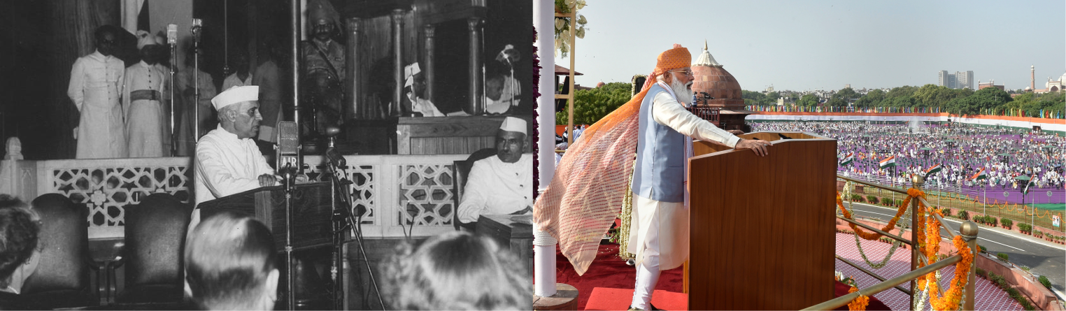
Every Year, we celebrate August 15 as our Independence Day and eagerly wait for the Prime Minister’s speech and then there happens discussion ranging from news hour debates to intellectual neighborhood talks!
All these speeches have been dissected and analyzed separately, but not ever put side by side to measure our progress as a nation.
India will be celebrating 75 Years of Independence in 2022, this data visualization will be an attempt to look at India’s journey in these years from the ‘ramparts of Red Fort’.
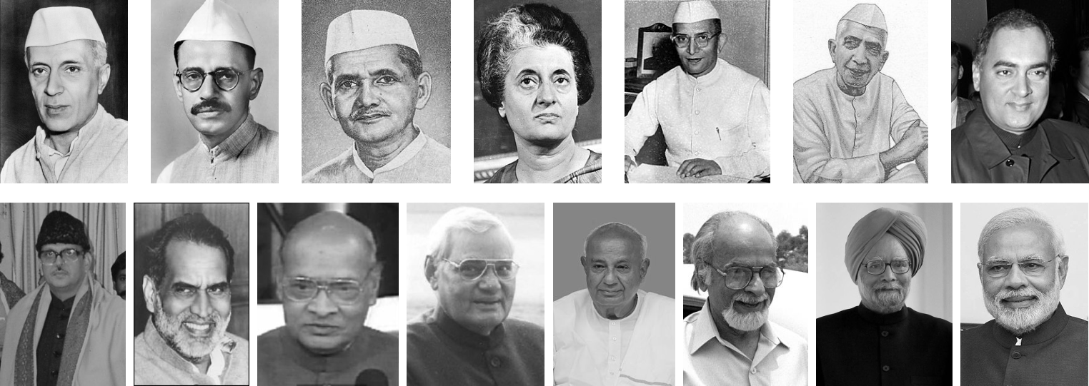
In all the years since Independence, we have seen 15 Different Prime Ministers. In their tenures, 9 of them have delivered multiple Independence Day speeches; 4 of them delivered one and two none.
“Every History is a History of Now”
Knowing this, we start with the part which is the latest and we are more familiar with. The two heavily compared Prime Ministers of India; Manmohan Singh and Narendra Modi.
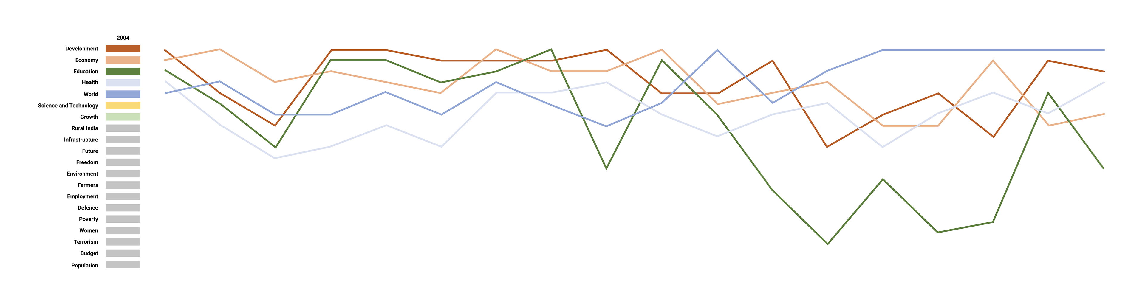
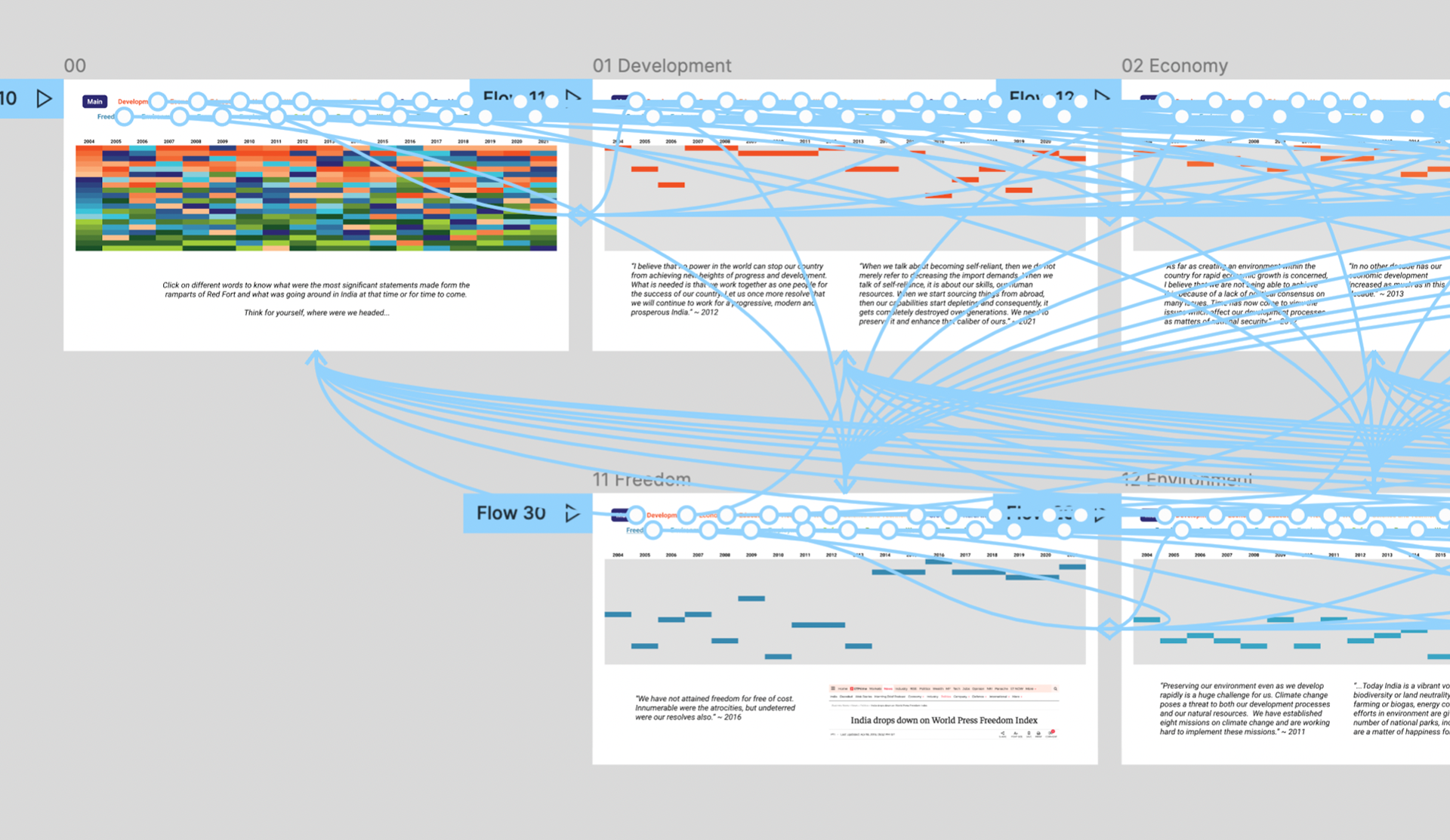
We performed sentiment analysis and then in the 21st century made a list of 21 topics and checked how they stood against each other in the speeches.
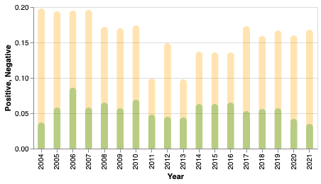
The sentiment analysis shows a minor dip in positive sentiments of the ending Congress rule which was tormented by corruption in its last tenure. But however great an orator our current Prime Minister is the AI is not convinced with the positivity here.
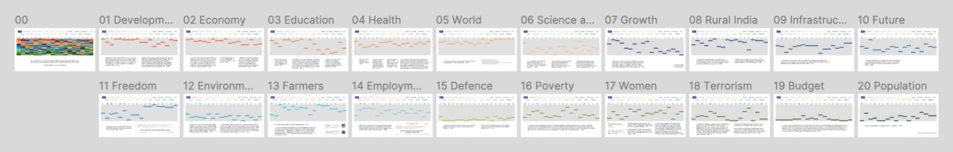
We directly dive into this following chart that ranks 20 topics that have been talked about from the Red Fort. The topics are ranked based on their frequency. Click on them to see how they fared as years passed. Below the graphic, you will find quotes or incidences before a sharp rise or fall of the relevance of the topic. See for yourself, how far have we come and how far are we yet to reach...
Stay tuned for the analysis of the remaining parts, the project’s scope also involves overlaying sound related to important incidents that have happened since Independence.
Jai Hind.
-- Process --
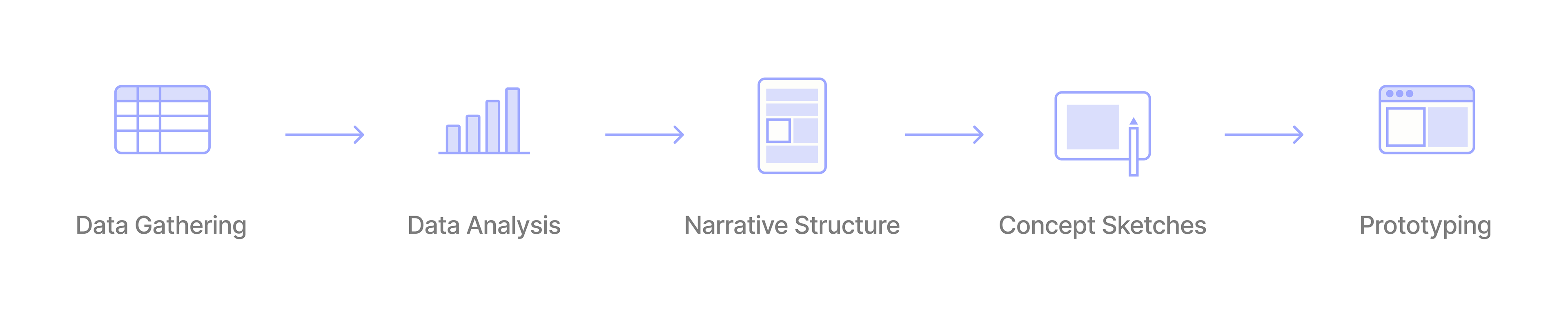
Data Gathering
Manually downloaded all the speeches from the portal of Press Information Bureau
Consolidated Hindi speeches are available here.
English translations were taken from the archives of PMO, from here.
Consolidated Hindi speeches are available here.
English translations were taken from the archives of PMO, from here.
Data Analysis
Tools Used: Google Collaboratory, Observable, Microsoft Excel
The text files were read in Google Colab notebook and Vader Lexicon Sentiment Analysis was performed on all the speeches. The data was then charted out in Observable.
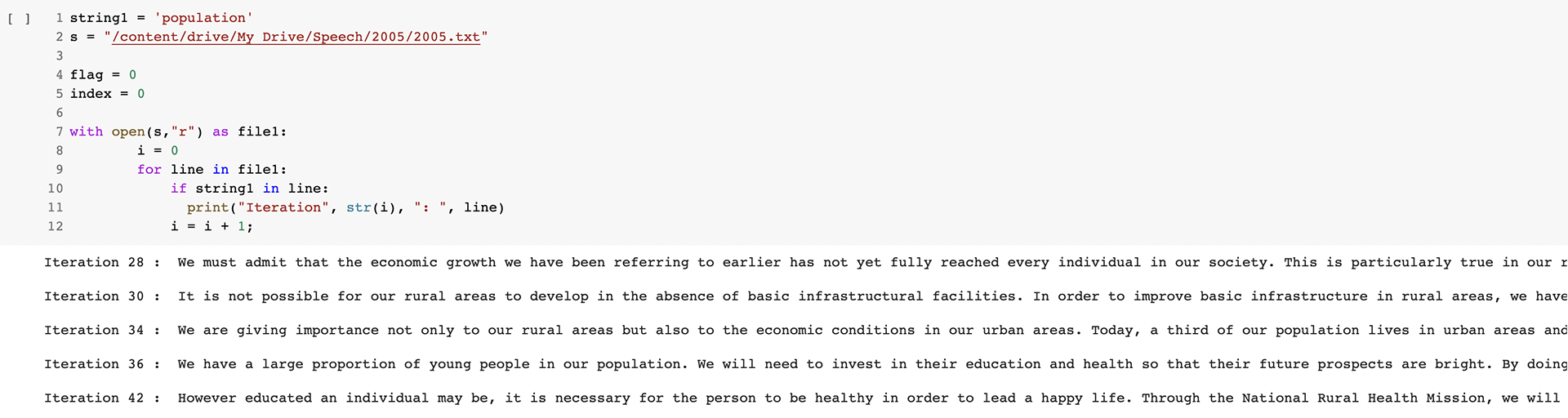
The next step was to count the number of words in the speeches but before it, the speeches were cleaned and new files were made.
The new files had no special characters and no stop words. The stop words were removed using nltk.stopwords.
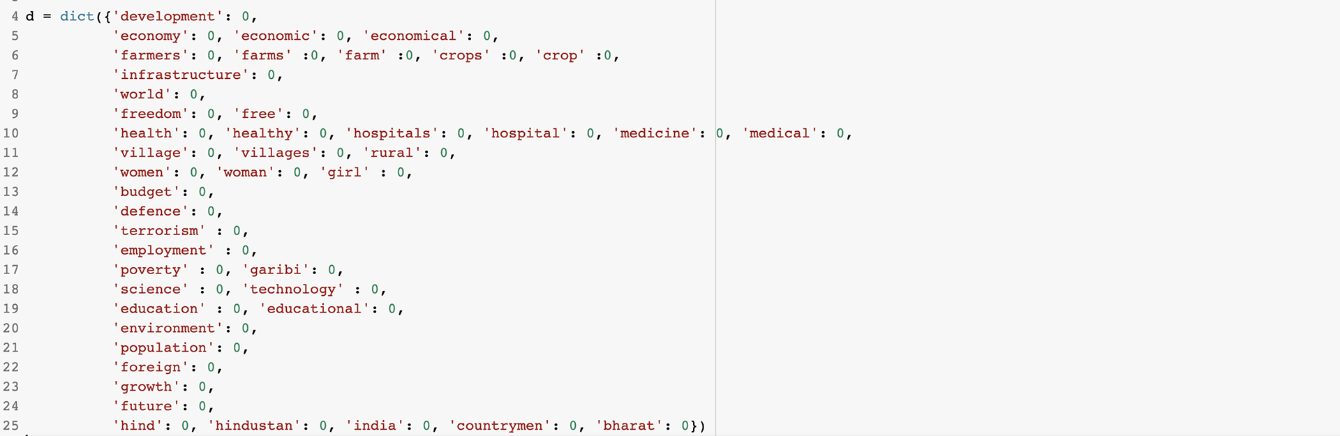
The next step was to bin certain words together to analyze them in a group. A list of 20 topics was prepared after reading two speeches manually to know the topics that are mostly talked about.
The text files were read in Google Colab notebook and Vader Lexicon Sentiment Analysis was performed on all the speeches. The data was then charted out in Observable.
The next step was to count the number of words in the speeches but before it, the speeches were cleaned and new files were made.
The new files had no special characters and no stop words. The stop words were removed using nltk.stopwords.
The next step was to bin certain words together to analyze them in a group. A list of 20 topics was prepared after reading two speeches manually to know the topics that are mostly talked about.
The count of them was then exported to Microsoft Excel and the following chart was created using Sort and Filter.
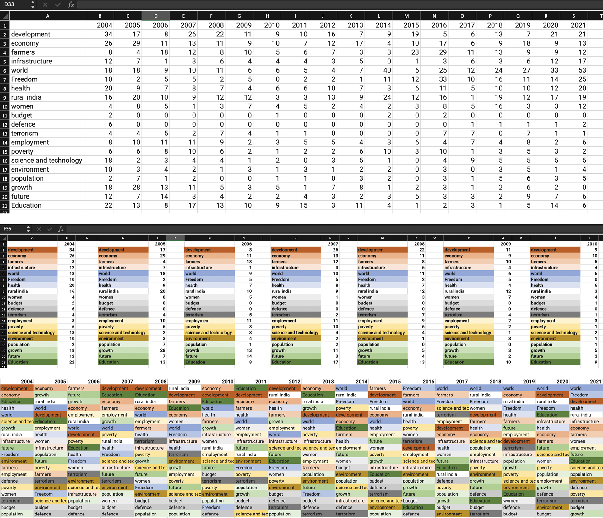
The final step was to see sudden rise or fall in ranking of topics and finding a relevant quote or news that made it happen. Colab was used to find ‘lines’ mentioning the word and the relevance was assigned as per personal preference.
Narrative Structure
The idea of India and the issues talked about is very subjective. The development I perceive might not be perceived as development by someone else. So not sticking to a narrative and just stating what was said in a speech looked the best way out. Readers are allowed to browse through ups and downs of the topics and decide for themselves, "How Far have we come?".
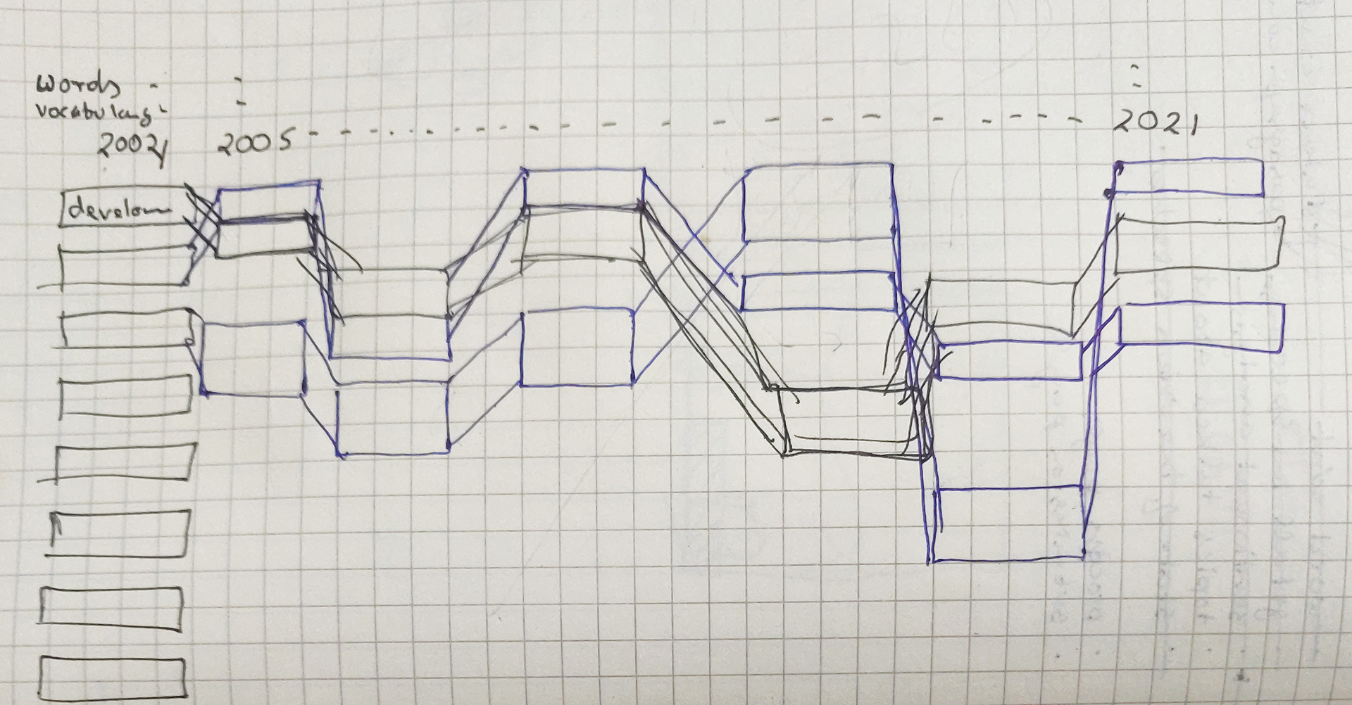
Concept Sketches
A modification of the Sankey Diagram and Stacked bar chart was narrowed down but while prototyping and with current coding skills the desired output wasn't achieved.
Prototyping
Prototyping was done in Figma and then embedded in HTML. The final presentation was then stitched together with HTML and CSS.
Way Forward
This Data visualization was made during 2 Week Course (and a few extended deadlines) at NID under the guidance of Amit Kapoor.
There was a lot to learn starting from Python to JS and from HTML to CSS. But there is still a long way to go. The second phase include handling of arrays and eliminating the need of Microsoft Excel and thereby creating the chart using code. Further Topic Analysis for every cell also needs to be done, wherein hovering over a particular cell tells you all the instances where it was talked about.
In addition to this, so far it is assumed that a topic with a higher word count was more important than a topic with a lower word count. The length at which a particular topic was talked about is ignored for a while. Length will be incorporated once Topic Analysis is done.
Lastly, eliminating the Figma black box!
Thank You, Amit for your Patience and Guidance.