It was strange to see that a Corporation of Hindustan Petroleum's stature which has been a part of India's ecosystem since 1975 had no corporate guidelines in place. The only thing that existed while I was there was a piece of paper on which the logo grid and brand colors were mentioned.
But when we observe the length and breadth of the Corporation we understand where the problem lies. HPCL has its entities in the remotest corners of the country and whenever a need to reproduce the Logo or Stationery arrived it was extremely urgent and a local vendor was chosen.
The local vendor had no time to wait for a higher resolution file, would scan the existing version and recreate it.
The logo became a Chinese whisper and kept on getting modified.
Primary Research
A simple google search gave us the following versions of the iconic logo:
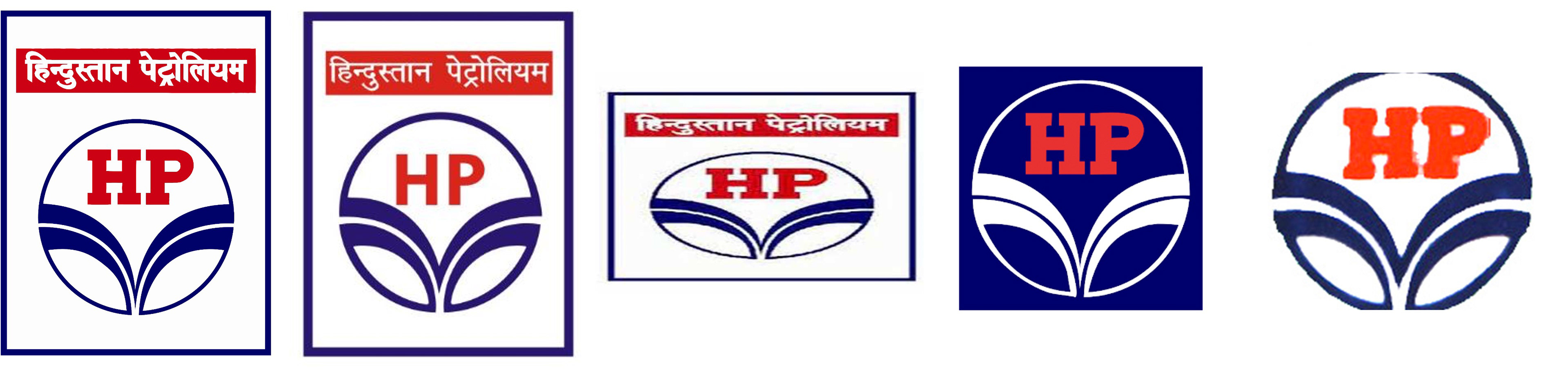
Incorrect Devnagari font used, Incorrect Latin font in the center, Aspect Ratio distorted, Inverted Colors,
Painted and Outer boundary eliminated
Secondary Research
Then we began looking within our reach to see how deep the problem goes, and also invited Corporate Stationery sets from all four corners of the country.
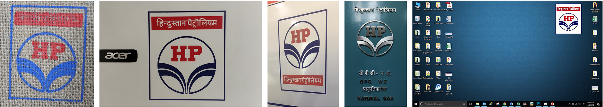
Incorrect logos within our reach, Distorted elements, Incorrect Oil Spurt, Rearrangement of elements, Elimination of outer boundary, no clearance space given, and incorrect aspect ratio
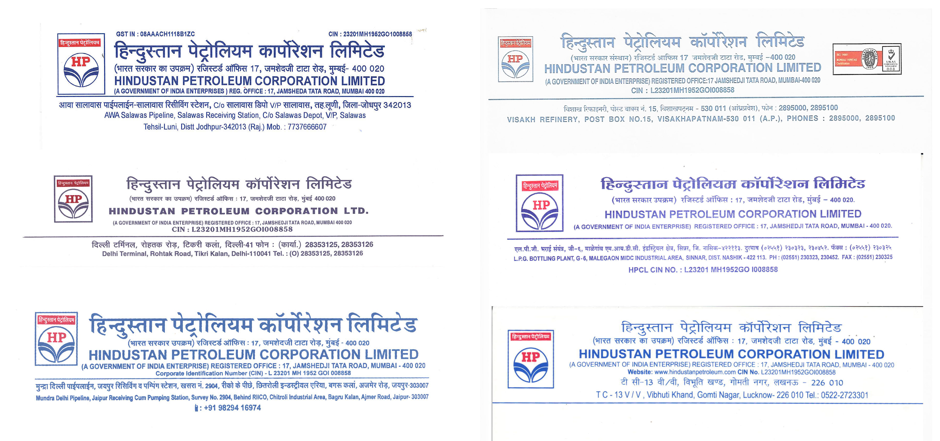
Different Business Units, different letterheads
The same was observed for other collaterals like Identity Card, Visiting cards, DO letterheads, envelopes, etc.
Summary
• Multiple variations of logo floating in the market (colors, aspect ratio, design)
• No specific guidelines regarding fonts to be used with the logo
• Cluttered design of visiting card and letterhead
• Various presentation templates
• Lack of uniform branding across all customer touchpoints
Because of this, there is a lack of coherence and the identity gets diluted.
Defining the Scope
"The HPCL logo is the symbol of our company and all that we stand for. Our locations are spread across the length & breadth of the Country and it is imperative that it must be depicted precisely and consistently. The logo execution, the colors, and the typefaces have to work together as our Corporate Identity."
Corporate Identity Manual to include the following:
• Logo along with its Grid
• Logo Colors in RGB, CMYK & PANTONE
• Detailed usage guidelines
• Examples of Incorrect Usage
• Typographic Guidelines
• Minimalistic Brand Guidelines
• Tagline
• Functional Application (visiting cards, ID cards, letterheads, etc)
• Corporate writing style
Grid and Options
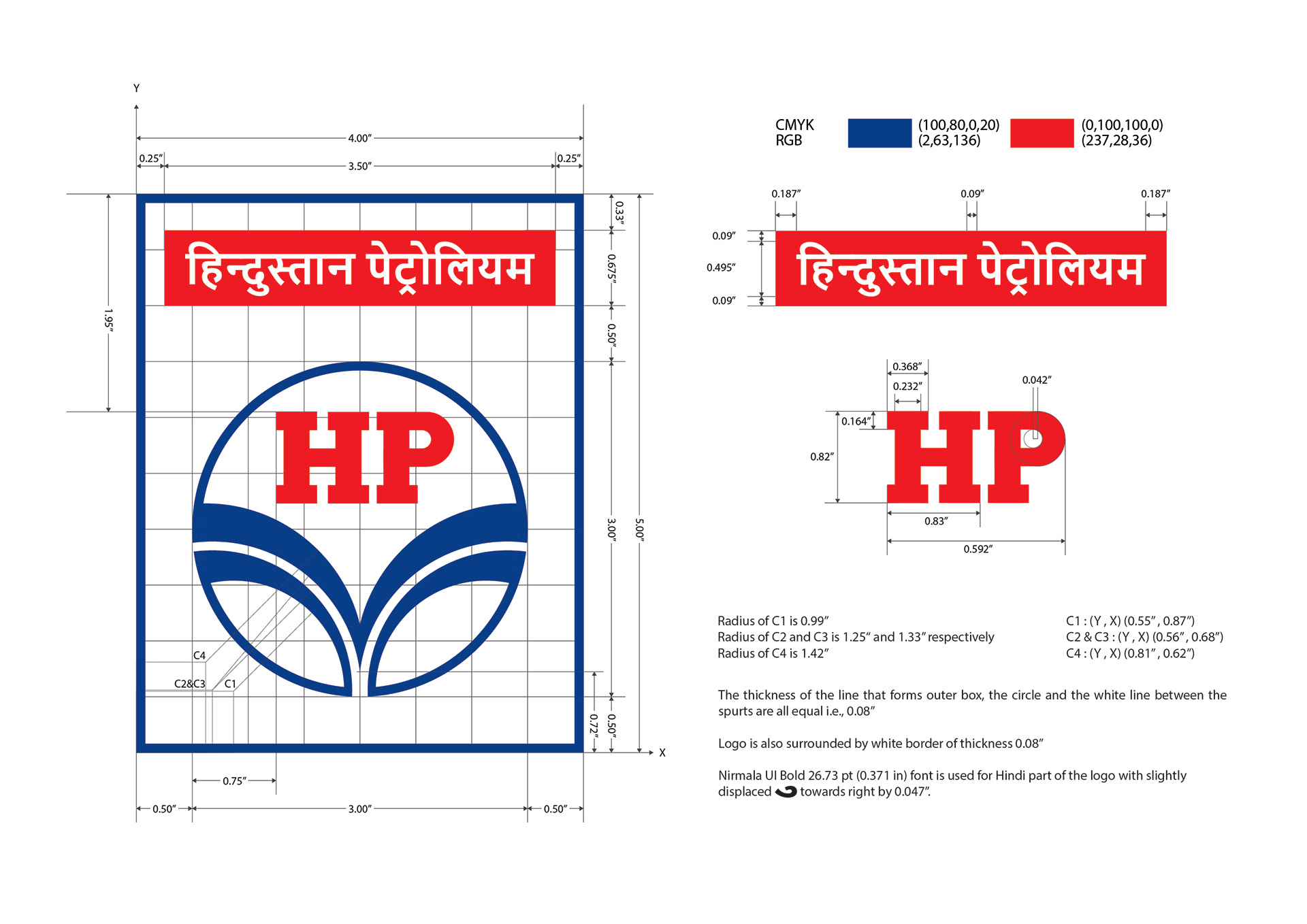
Logo Grid and Cheat Sheet
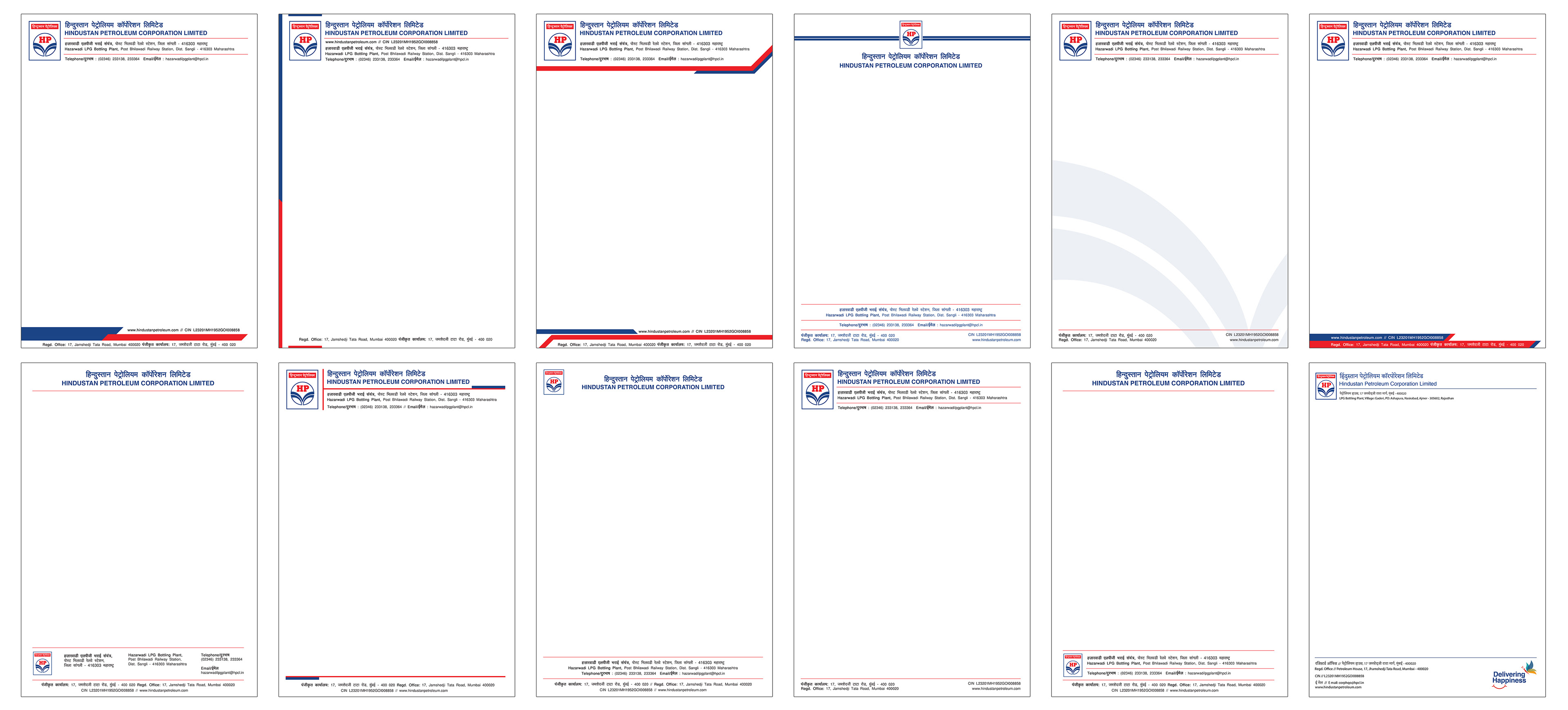
Letterhead options
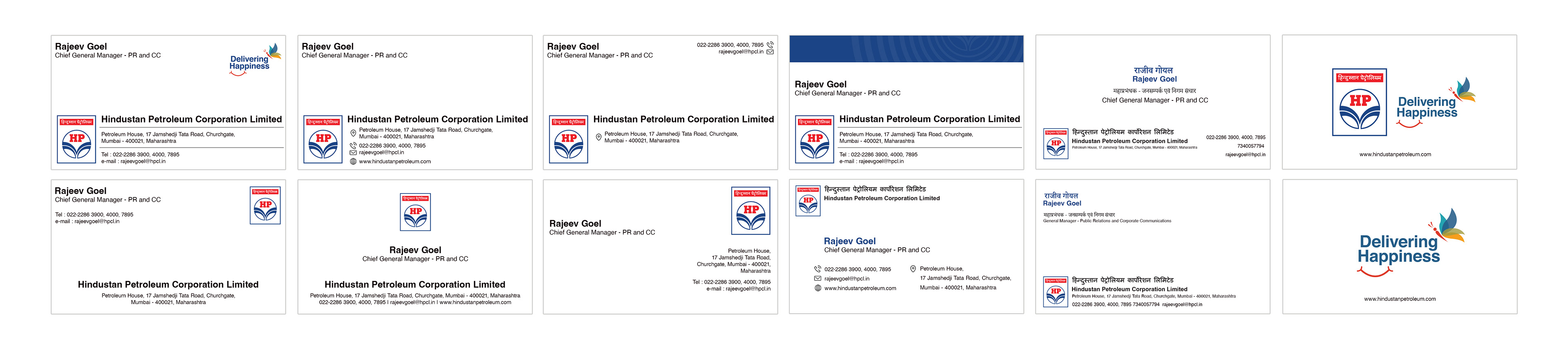
Visiting Card options
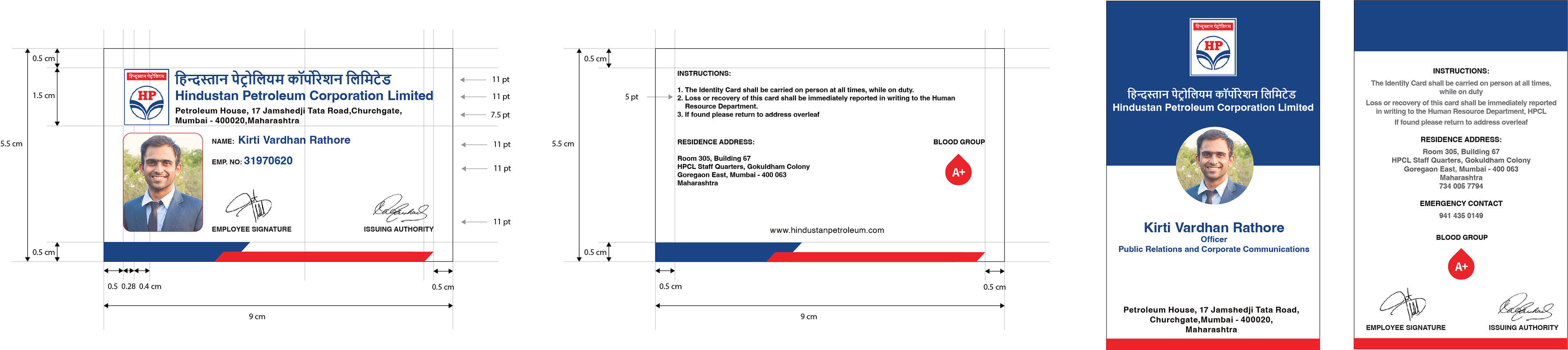
Identity Card Grid and Options
Identity Manual