File Explorer, previously known as Windows Explorer, is a file manager application that is included with releases of the Microsoft Windows operating systems from Windows 95 onwards. It provides a graphical user interface for accessing the file systems.
This module led by Mrs. Mamata Rao demanded us to do a usability study of the file explorer and then redesign it.
Usability Study
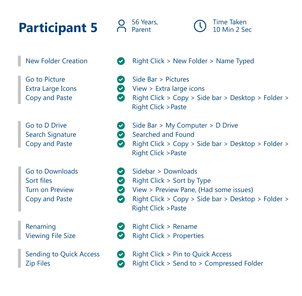
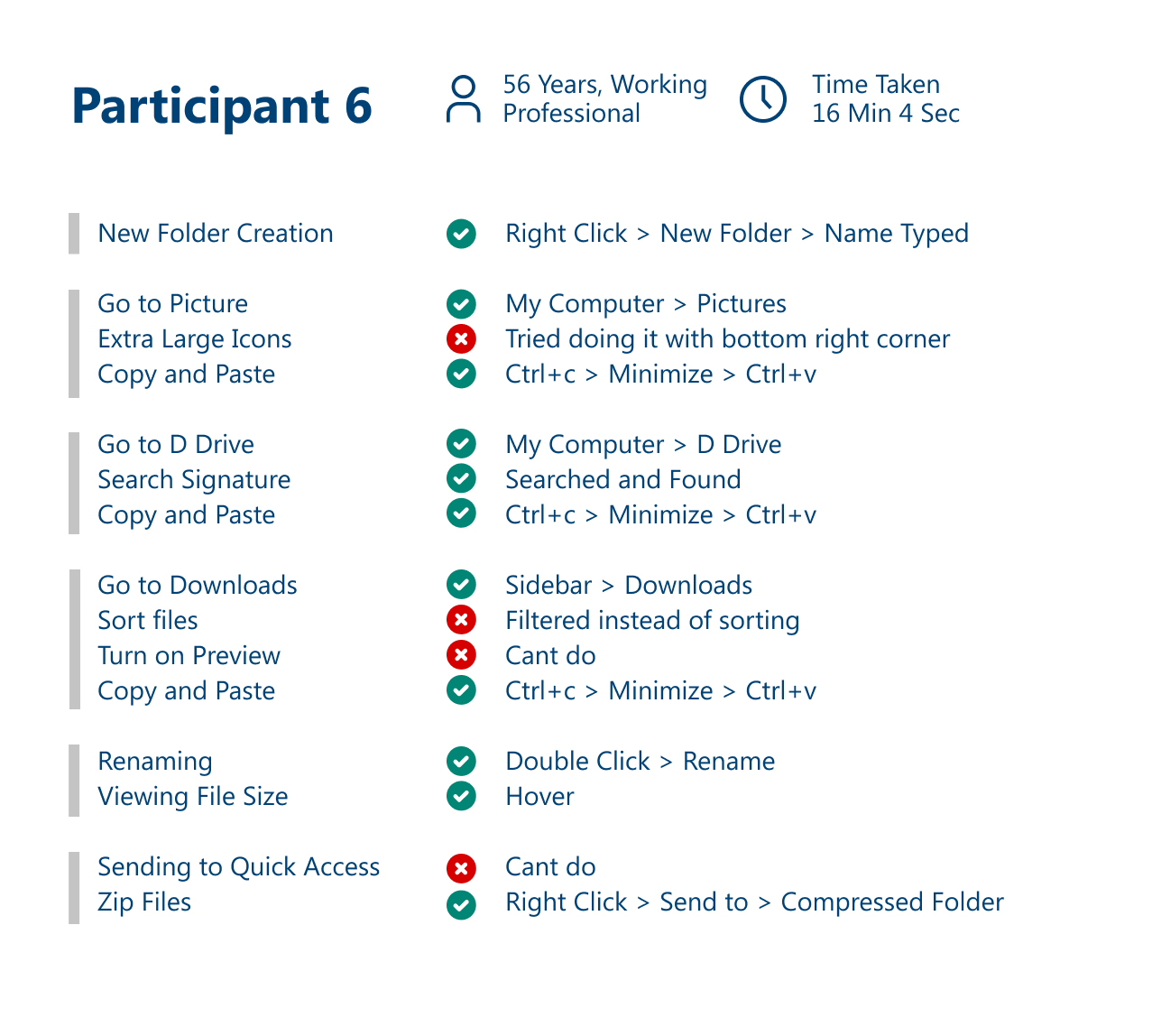
Usability study was conducted for 6 participants to identify the issues faced while using the Windows File Explorer.
Scenario Building
1. Filling form for a competitive exam that requires Passport Size photo (JPEG/ PNG), Signature (JPEG/PNG), Aadhar Card Scan (PDF)
2. Since it is an exercise with explorer, the files are already in proper dimensions and formats
3. Move all the files to a folder on Desktop
4. Location of required files
• Passport Size Photo: Pictures folder
• Signature: D Drive
• Aadhar Card: Downloads
2. Since it is an exercise with explorer, the files are already in proper dimensions and formats
3. Move all the files to a folder on Desktop
4. Location of required files
• Passport Size Photo: Pictures folder
• Signature: D Drive
• Aadhar Card: Downloads
What to do?
1. On the Desktop, create a folder named ‘Competitive Exams’. It contains a new Folder titled ‘Exam 1’. Copy the mentioned files from their respective locations to the Folder ‘Exam 1’, by doing the following:
• To view the files in Pictures folder, enlarge the icon size to ‘Large Icons’
• Search for the file name ‘User Test Sign’ in D Drive to get to the file
• To view the Aadhar card in Downloads, sort the files/folders according to their type turn on the ‘File Preview’
2. Moving all the files to the ‘Exam 1’ folder, rename them as follows:
• Passport Size Photo: PP_SIZE
• Signature: SIGN_SIZE
• Aadhar Card: AC_SIZE
3. Since you got to keep using this folder for other exams, Pin the folder in Quick Access
4. Finally Zip the folder with the name ‘Test Successful’
Task Categorization
User Identification
Performing Tasks
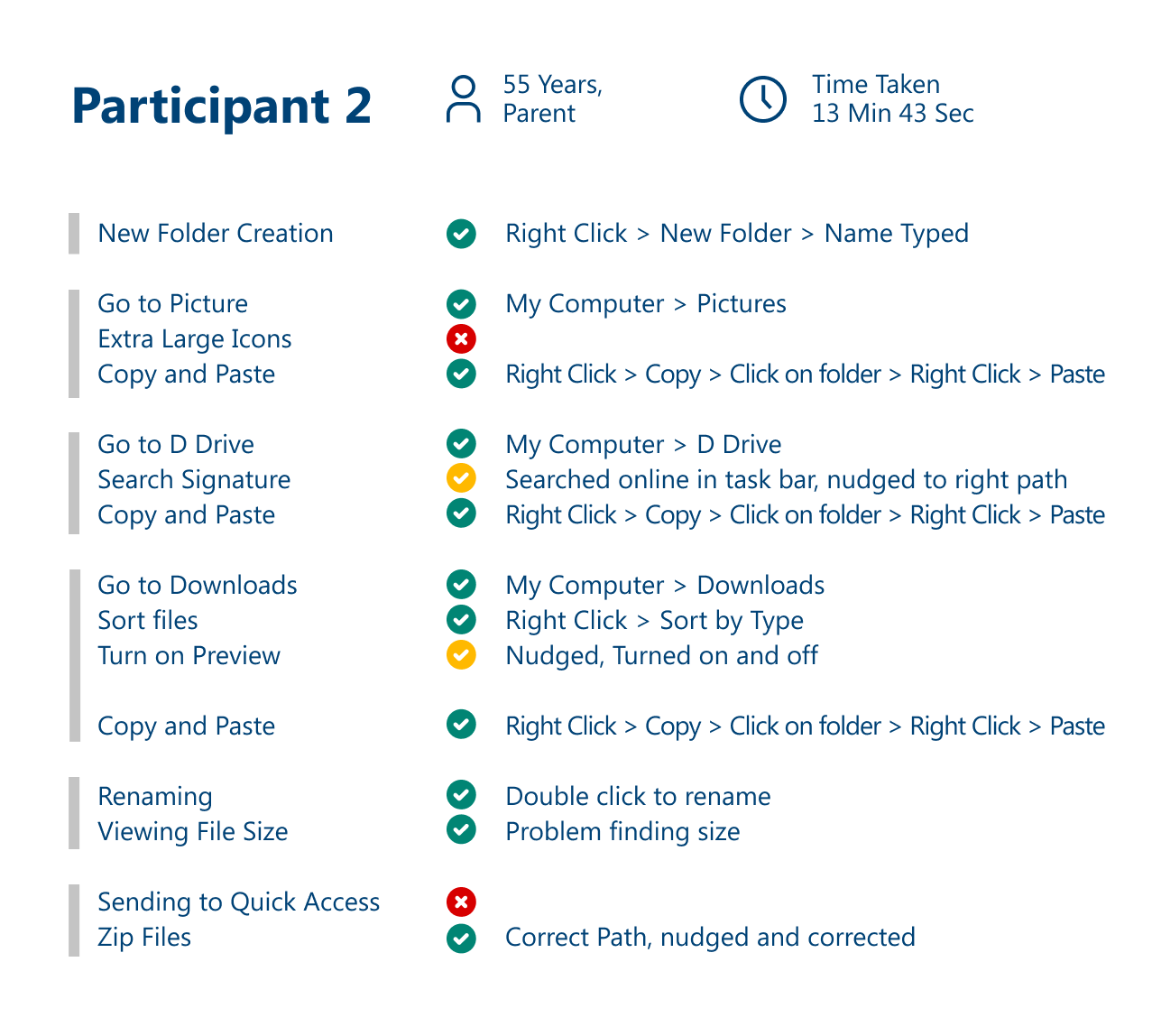
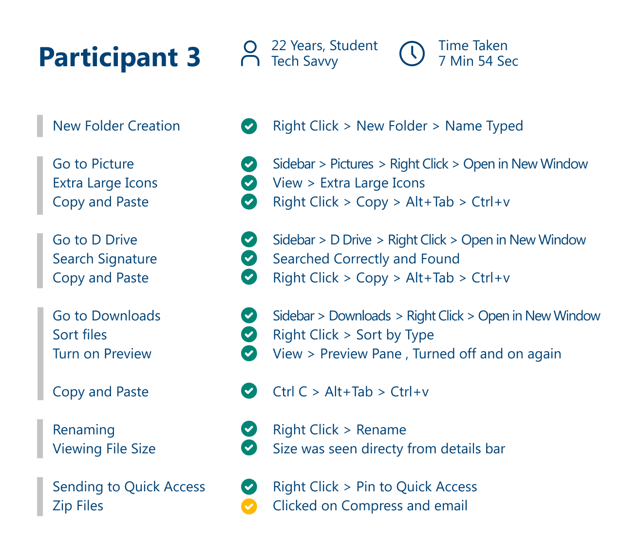
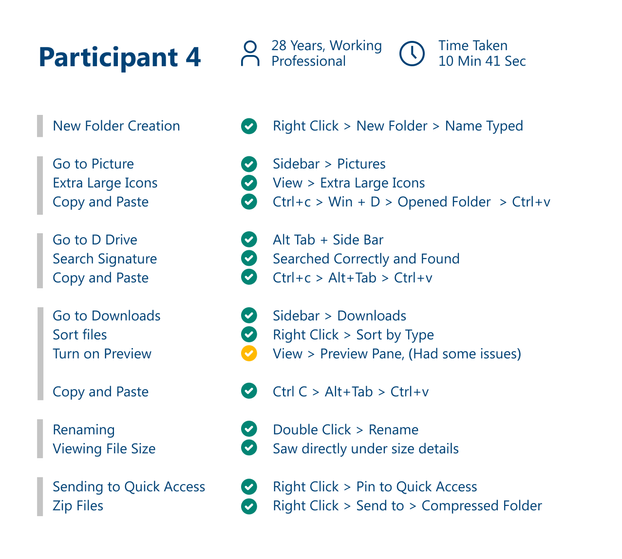
Recommendations
Zip option to be brought out of ‘Send to’ option
Toggle button for quick access bar
Better feedback on Preview Pane and toggle view of Preview Pane can be brought into Right Click > View
__________
Redesigning Windows File Explorer
User Persona
Design Brief
To modify the windows file manager such that it becomes easy to locate similar files and also help in removing duplicate files.
Solution
Creating ‘Smart Tabs'. Smart Tabs will be a collection of similar files spread across the system. They will act as an extension to ‘Shortcuts’ as actions performed on them will be visible on the main file as well.
Smart Tabs will be highly customizable; from the color of the tab to their default view, everything can be varied depending on the files stored inside the tab and your preferences.
Smart Tabs will be highly customizable; from the color of the tab to their default view, everything can be varied depending on the files stored inside the tab and your preferences.
Information Architecture
All the files follow the already existing Windows architecture. When ‘Smart Tabs’ are created, they start showing particular file types inside those tabs. When deleted from the tabs they prompt and ask if we would like to delete the main file as well or just its instance from the 'Smart Tab'
Low Fidelity Wireframes
The Smart Tabs setup will begin the moment we start our PC for the first time. The wireframes while setting up of Windows and after setting up look like this:
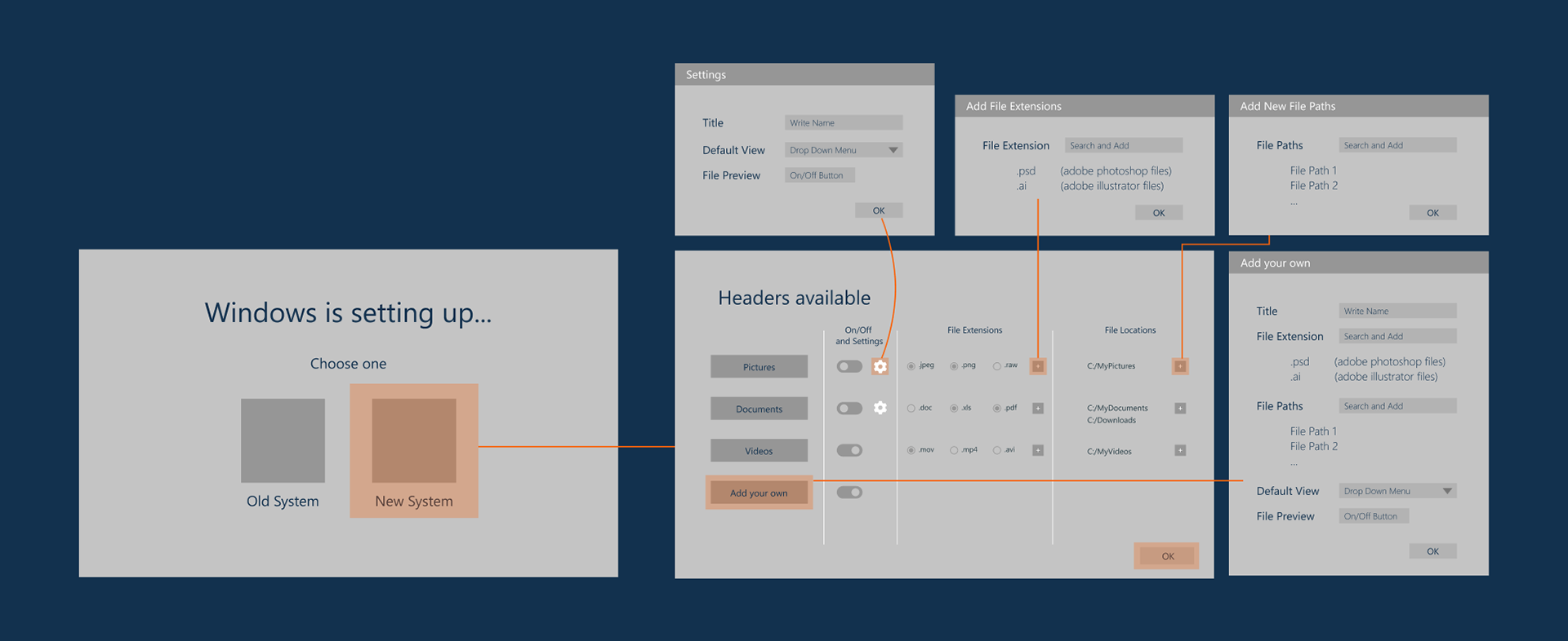
Wireframes, while setting up of windows

Wireframes, after setup
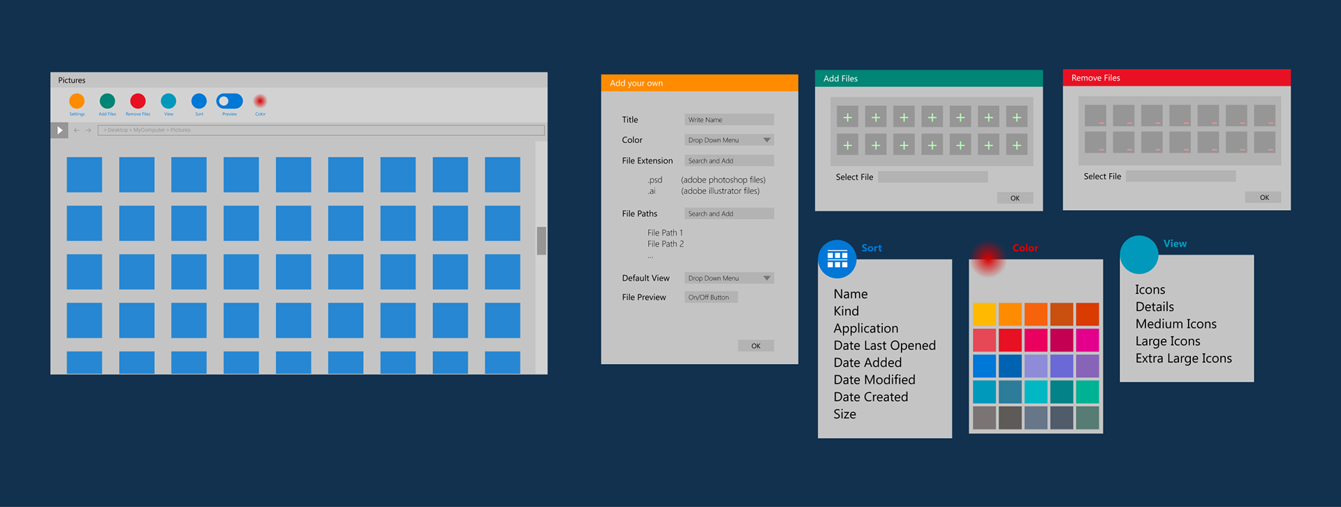
Added menus under Smart Tab
High Fidelity Prototype
Setting up smart tabs on Windows' first start
Additional Menus to add a new category
After adding a new category
Smart Tabs icon added on the Task Bar
Toggle button on Quick Access Bar
New Icons added in Organise Tab
New Icons added in Organise Tab
Walkthrough Video

